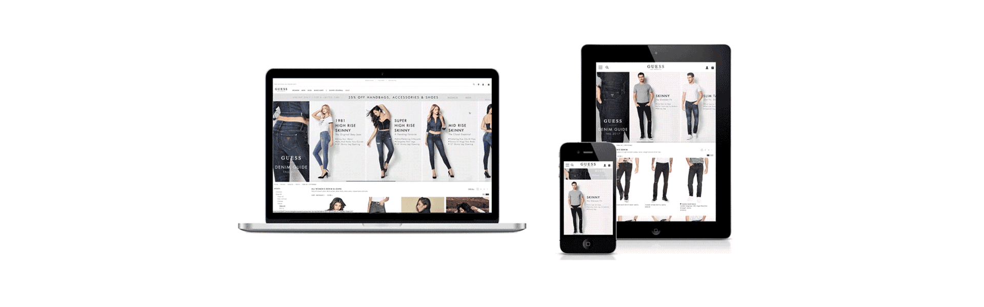
Guess denim guide | fall 2017
Finding the perfect pair of jeans is a challenge for many. Guess is known worldwide for it’s iconic denim and as the global retailer began to focus on a web first mentality, the UX team developed a responsive design that would launch with the new Fall 2017 Denim line in order to help customers easily navigate through denim styles on desktop, tablet and mobile while shopping online for the perfect pair of jeans.
Core Team & Project Roles
Visual Designer: Karina Limon
Front End Developer: Sasha Mattison
PROBLEM
The return rate for online denim purchases is higher than the in-store purchase. While the in-store customer has the help from an associate to explain the different types of denim styles and fit to chose from, the customer that prefers to shop online does not have that personalized experience via web.
solution
Create a responsive online Denim Fit Guide that customers can use to easily navigate and educate themselves about the different denim styles and the details about the fit in order to feel confident about their online purchase.
DESIGN PROCESS
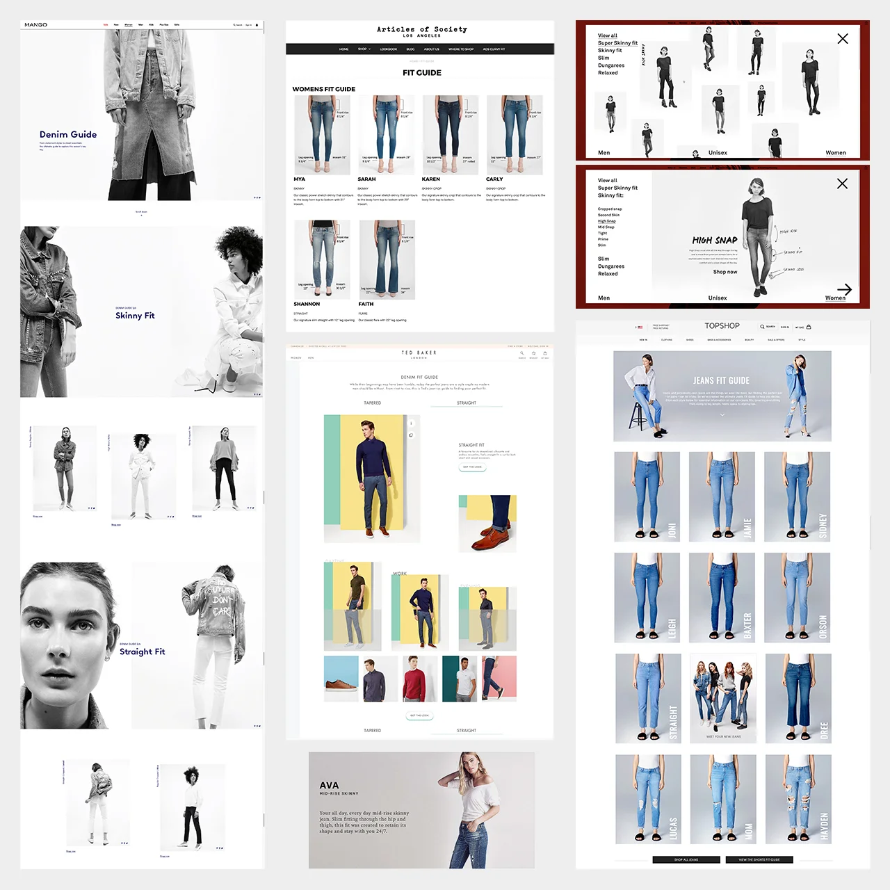
competitive analysis
Competitor brands were also launching their Fall Denim line with online fit guides. Researching each brand consisted of testing out the overall functionality and navigation of the guide and readability of the information and detail that was being presented to the customer.
Most brands seemed to have launched a Landing Page dedicated to the styles of denim that were available. Although these pages are informative, they all seemed to overwhelm the user with information that is not essential about a the fit of jean and in addition the user is not able to directly shop for styles on the landing page without being redirected to a product landing page first.
The most common paint points were:
• No product to purchase directly on the Landing Page
• Overwhelming copy not speaking to fit
• Unclear Call to Action on some pages
• Some Landing Pages were being used as a branding moment only VS driving performance
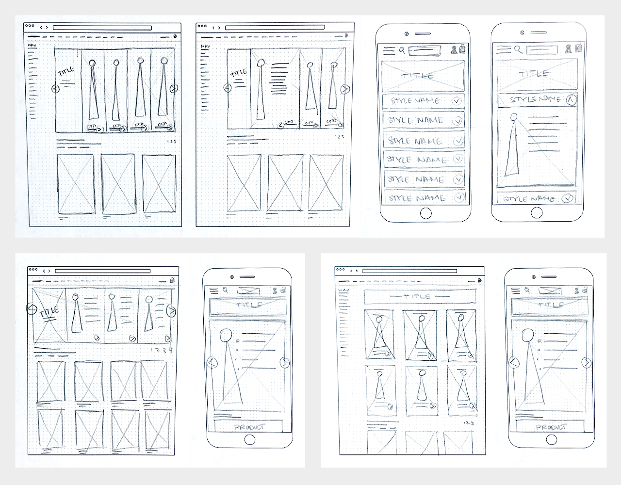
Lo-fi SKETCHING & WIREFRAMING
After reviewing my research, I determined the top feature needs that would support the product’s goals:
• The Fit Guide would live directly on the Denim Landing Page and to include product that can be purchased VS having it on it’s own Landing Page
• Adhere branding guidelines to preserve brand identity, but omit large lifestyle imagery that would push product further down the page
• List out bullet points with concise information about style and fit VS product descriptions
Low fidelity sketches were created and I began to work together with 2 front-end web developers and 1 UX Researcher to determine functionality.
initial iterations
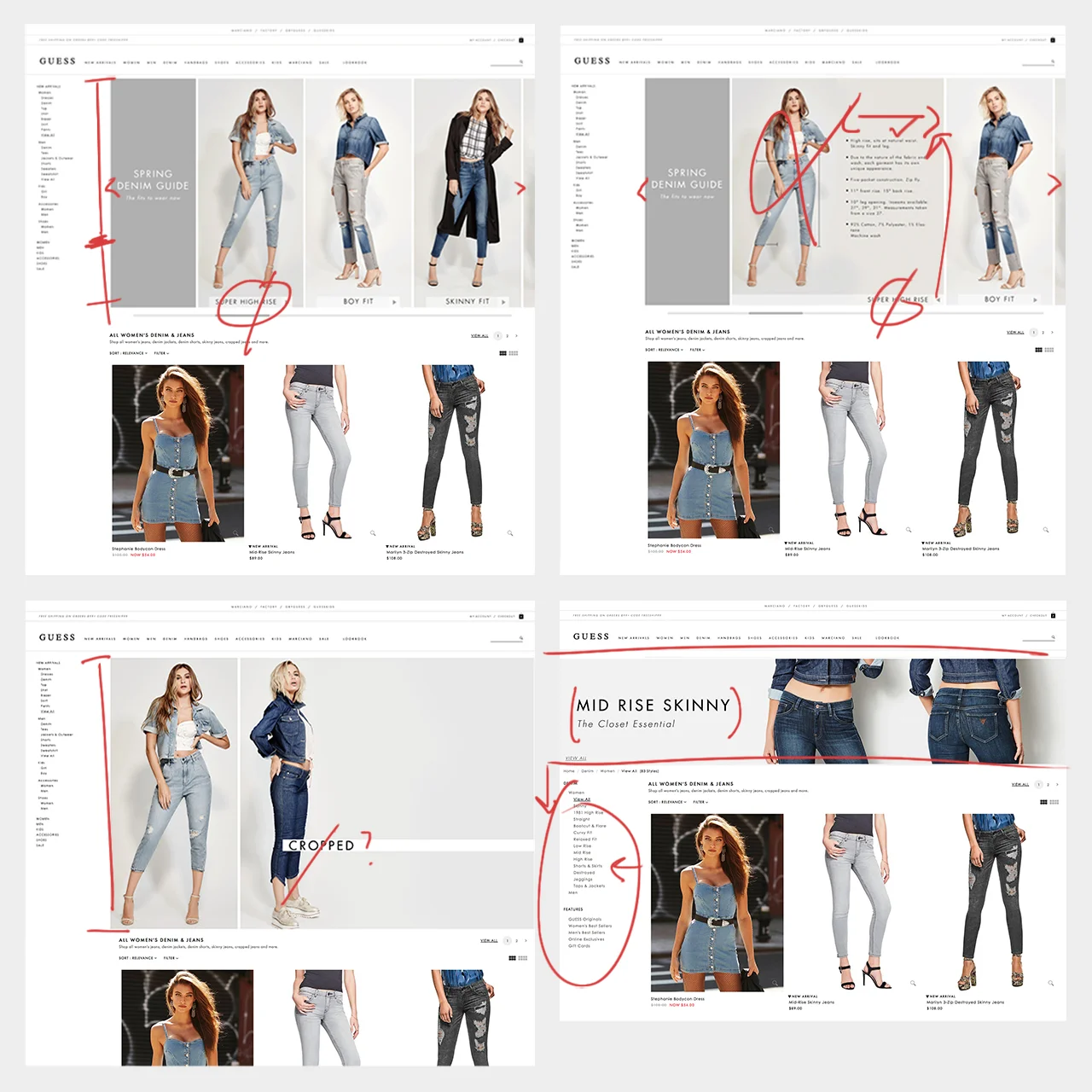
High fidelity wireframes & initial iterations were created to determine functionality and user interaction. The feedback that was gathered from the UX team (3 Developers & 1 UX Researcher) is as follows:
• Shorten height of the guide in order to pull product above the fold
• Eliminate extra step for the user to reach information about fit by removing CTA style names
• Move the guide to live in the Content Center VS as a Category Banner and push the Left Navigation below the guide VS to the left of it
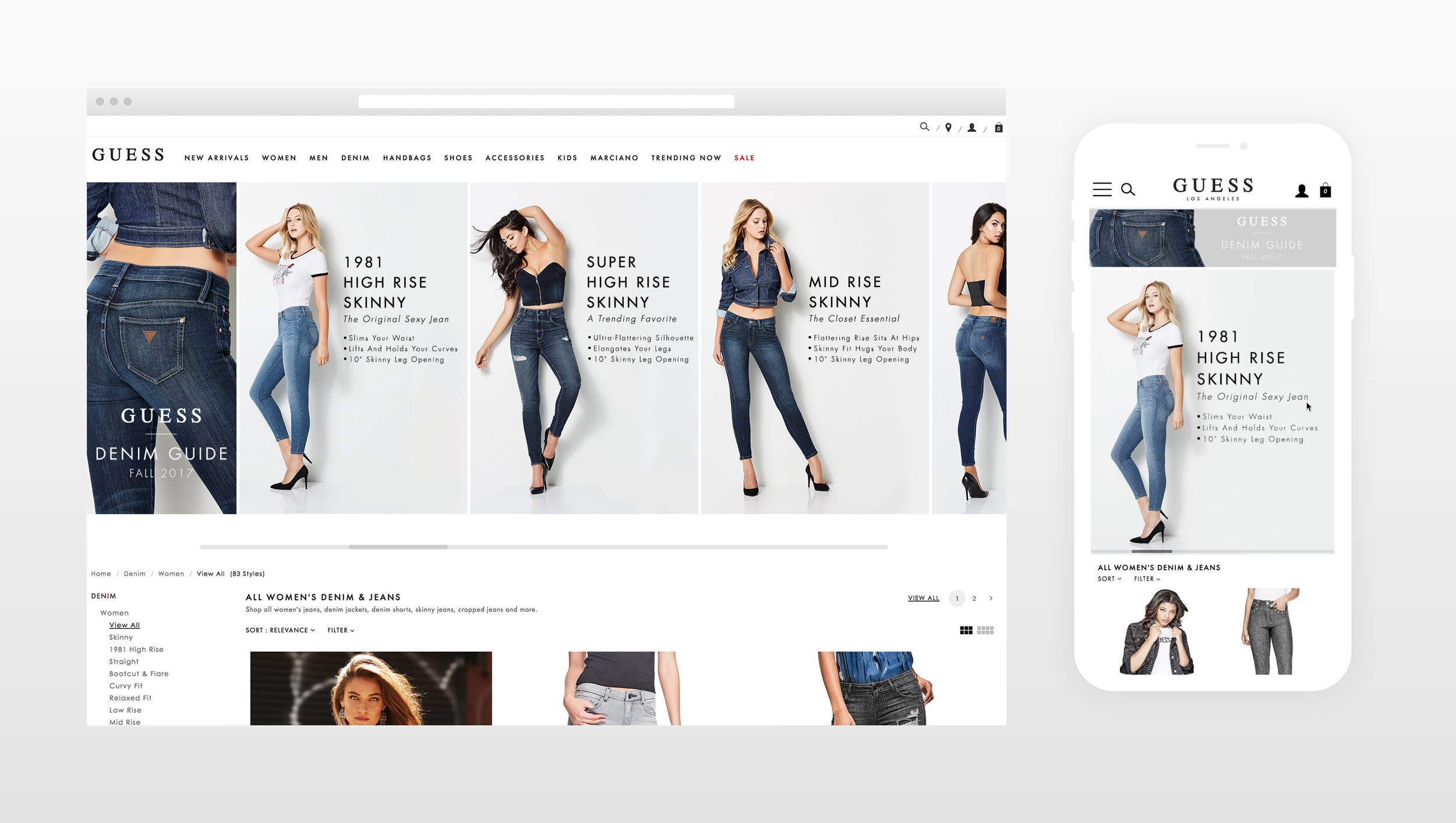
FINAL PRODUCT - ui vISUAL DESIGN
The final Denim Guide launched with 3 breaking points (Desktop, Tablet & Mobile). The initial design was to implement a static banner, but due to the number of styles available, I decided to implement an infinite carousel. This favored our mobile first approach so that the product would not be pushed further down the page. By moving the carousel to live in the Content Center and pushing the navigation below the guide, we were also able to bring the product further up and we began to implement this layout to future banners, look books & a dress guide.
Watch below for a begining-to-end user flow.